border-radius 神器!不兼容IE解决办法
border-radius是个很神奇的CSS3属性,还记得几年前做圆角矩形时用图形+表格实现,非常繁琐并不利于SEO,现在好了,有了border-radius一切变得很简单。
现在CSS3已经可以轻松实现跨浏览器的圆角效果,包括Firefox高版本,IE9,Safari,Chrome等高端浏览器。
我们这样去定义一个盒子模型:
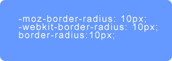
- moz - border - radius : 10px ; - webkit - border - radius : 10px ; border - radius : 10px ;在Firefox,和Chrome中的效果:
其中 -moz-border-radius 是 Firefox 实现圆角的私有属性,而 -webkit-border-radius是 webkit 内核浏览器(如 Safari 和 Chrome)实现圆角的私有属性。
我们也可以分别设置4个圆角的属性值,例如这样的样式:
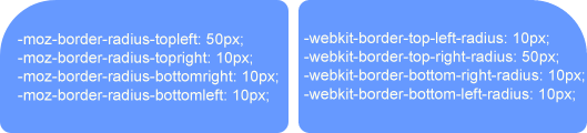
- moz - border - radius - topleft : 50px ; - moz - border - radius - topright : 10px ; - moz - border - radius - bottomright : 10px ; - moz - border - radius - bottomleft : 10px ; - webkit - border - top - left - radius : 10px ; - webkit - border - top - right - radius : 50px ; - webkit - border - bottom - right - radius : 10px ; - webkit - border - bottom - left - radius : 10px ;得到的效果如下图:
我们还可以使用CSS缩写样式实现圆角效果,例如下面的代码:
- moz - border - radius : 50px 30px 20px 10px ; - webkit - border - radius : 20px 10px 5px 50px ;当然我们也可以为盒子模型添加边框属性:
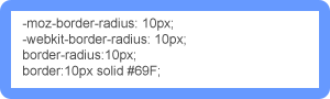
- moz - border - radius : 10px ; - webkit - border - radius : 10px ; border - radius : 10px ; border : 10px solid #69F;


 鲁ICP备09092366号Copyright StarArly.com. All Rights Reserved.
没有评论,留下你的印记,证明你来过。
◎欢迎参与讨论,请在这里发表您的看法、交流您的观点。